[project description:]
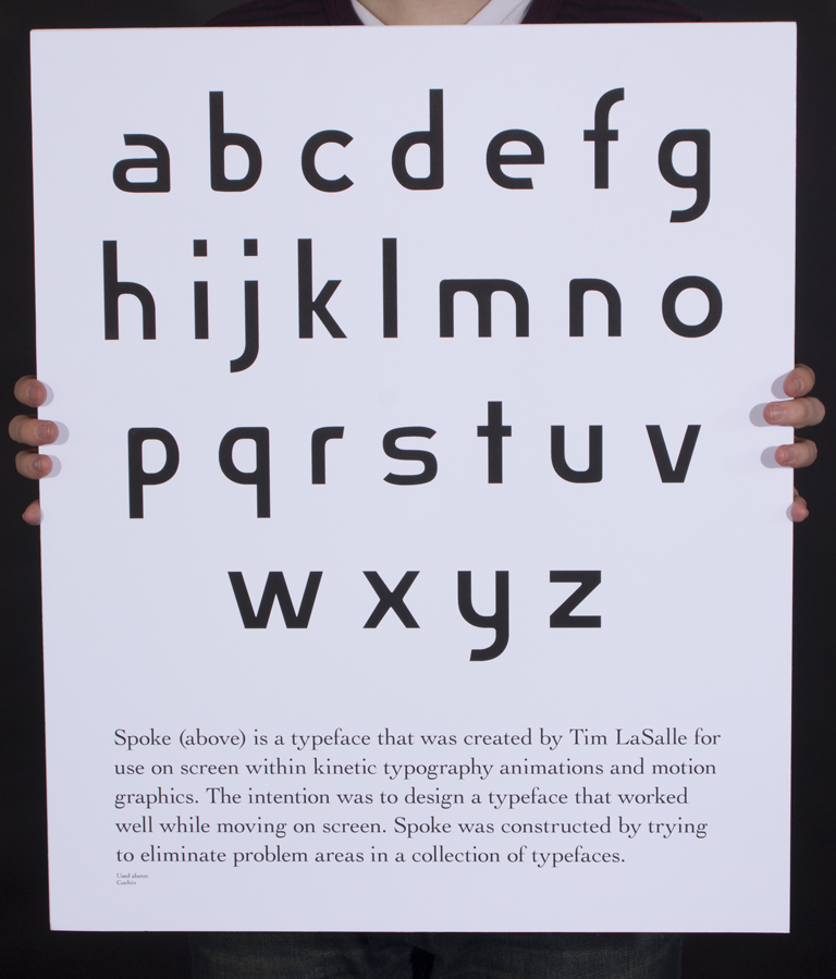
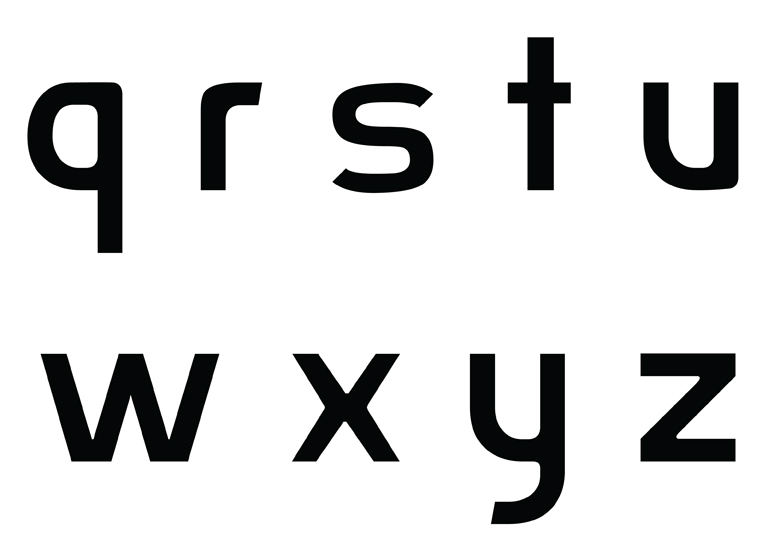
For my BFA thesis in Graphic Design I decided to create a typeface that would be specifically for use on-screeen in kinetic typographic environments. By observing other typefaces while moving I was able to point out trouble spots. While drawing my own typeface I tried to correct as many of these trouble spot as posible. This turned out to be a huge project, I was able to create a uni-directional lowercase typeface that worked very well.
For my BFA thesis in Graphic Design I decided to create a typeface that would be specifically for use on-screeen in kinetic typographic environments. By observing other typefaces while moving I was able to point out trouble spots. While drawing my own typeface I tried to correct as many of these trouble spot as posible. This turned out to be a huge project, I was able to create a uni-directional lowercase typeface that worked very well.
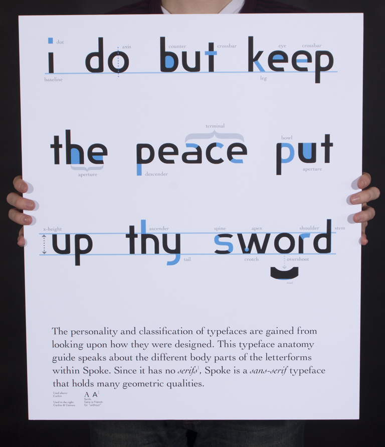
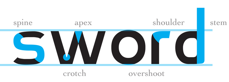
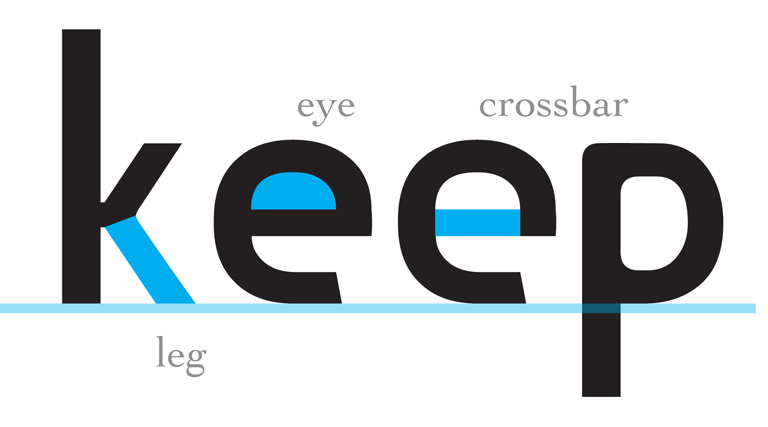
I created posters to hang in the BFA exhibition that was held at the Samuel Dorsky Museum of Art (SDMA) on the New Paltz campus. With these posters I wanted to inform the audience of the purpose of my typeface and also facts about the construction of a typeface in general (the anatomy). Along with the posters, I had a large flatscreen television with a video (below) playing and my process book.
The text is sourced from “Romeo and Juliet” by William Shakespeare.